Struggling Optimists
Role - UX Designer, UI Designer, Frontend Developer, Logo Designer
Duration - 6 weeks
Tools - Figma, Whimsical, Illustrator, Photoshop, Jira, Sketch
"Struggling Optimists" is a weekly podcast hosted by two university students who openly share their journey through the ups and downs of university life, socializing, prioritizing mental health, and maintaining personal relationships. Embracing the reality that life is a mix of wins and losses, the hosts discuss their struggles with humor and vulnerability, offering valuable lessons they've learned along the way. Launched during the COVID-19 pandemic, the podcast addresses the unique challenges students face during uncertain times. It goes beyond venting, aiming to find silver linings, celebrate small victories, and learn from setbacks. While uploading new episodes weekly, they encountered audience difficulty in finding episodes, and the podcast needed a more cohesive brand image to connect with its listeners.
1.0 Research and Discovery
Problems
Episodes were released on multiple platforms
Information on weekly episode drops was difficult to find
The podcast lacked a proper brand image
Proposed Solutions
Design a website that allows users to be able to locate information on episodes.
Create a brand logo and identity for the podcast
Address the multiple platforms episodes are released on.
Surveys Identified User Pain Points
I started my research with competitive analysis in order to understand the approaches and organization popular podcast websites have. User surveys would help me understand what podcast and episode related information is most important to users, so I could prioritize it. And lastly, one-on-one interviews could help me uncover users’ journeys in how they were able to continue listening and find information on the podcast and help identity their pain points.
Findings
1. Current users struggled to find information on where or what platforms they could use. They relied on searching directly through platforms themselves.
2. There was a decrease in continued podcast listeners due to the lack of visual representation and brand image.
3. Engagement in general was limited
Developing Empathy with Podcast Listeners
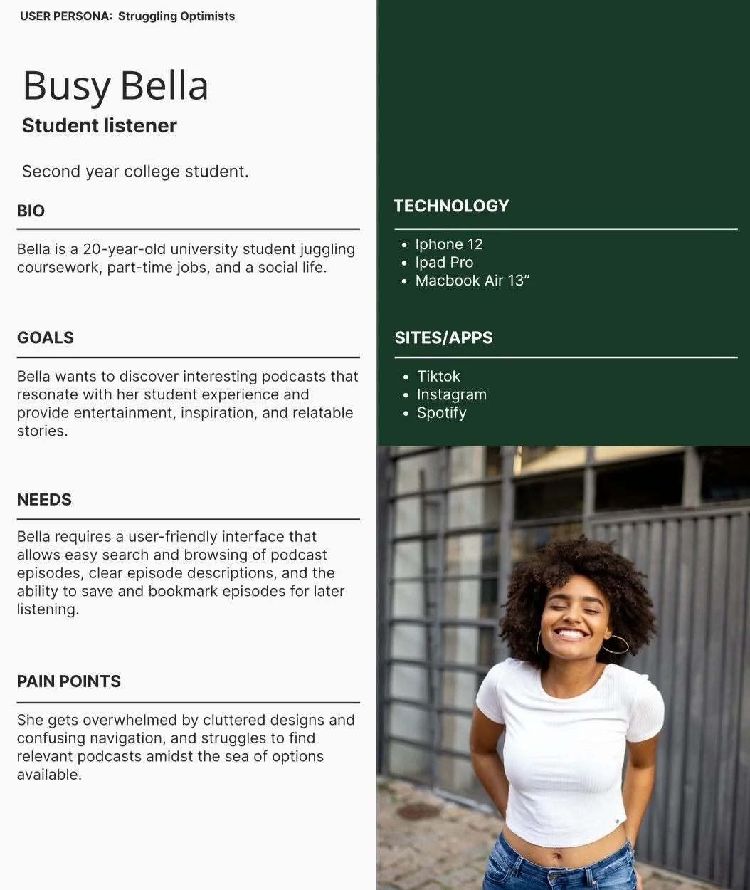
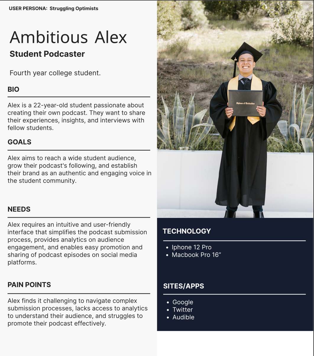
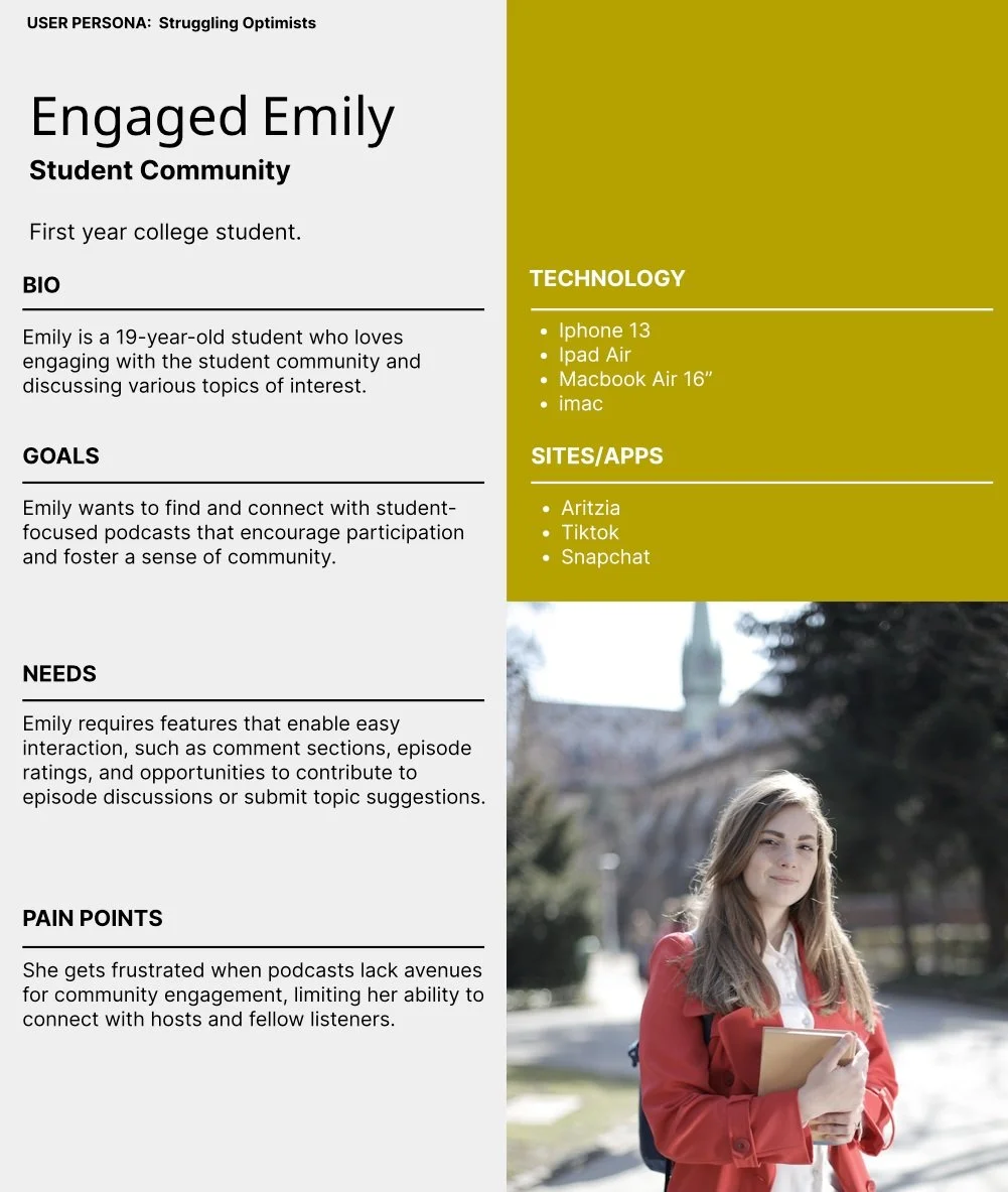
Because the basis and majority of this podcasts listeners were students , I felt it was important to represent them through three possible personas. These were designed by cross referencing quantitive and qualitative data from my user surveys and interviews. They would serve as important reference points for design decisions moving forward. For all “ Student listener “ and “student podcaster “ and “student community”.
Understanding the Journey
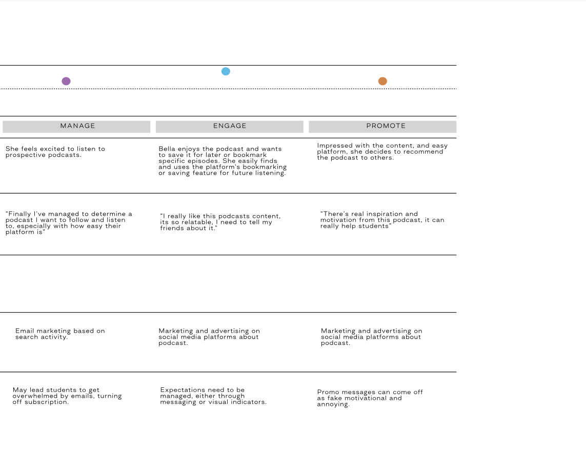
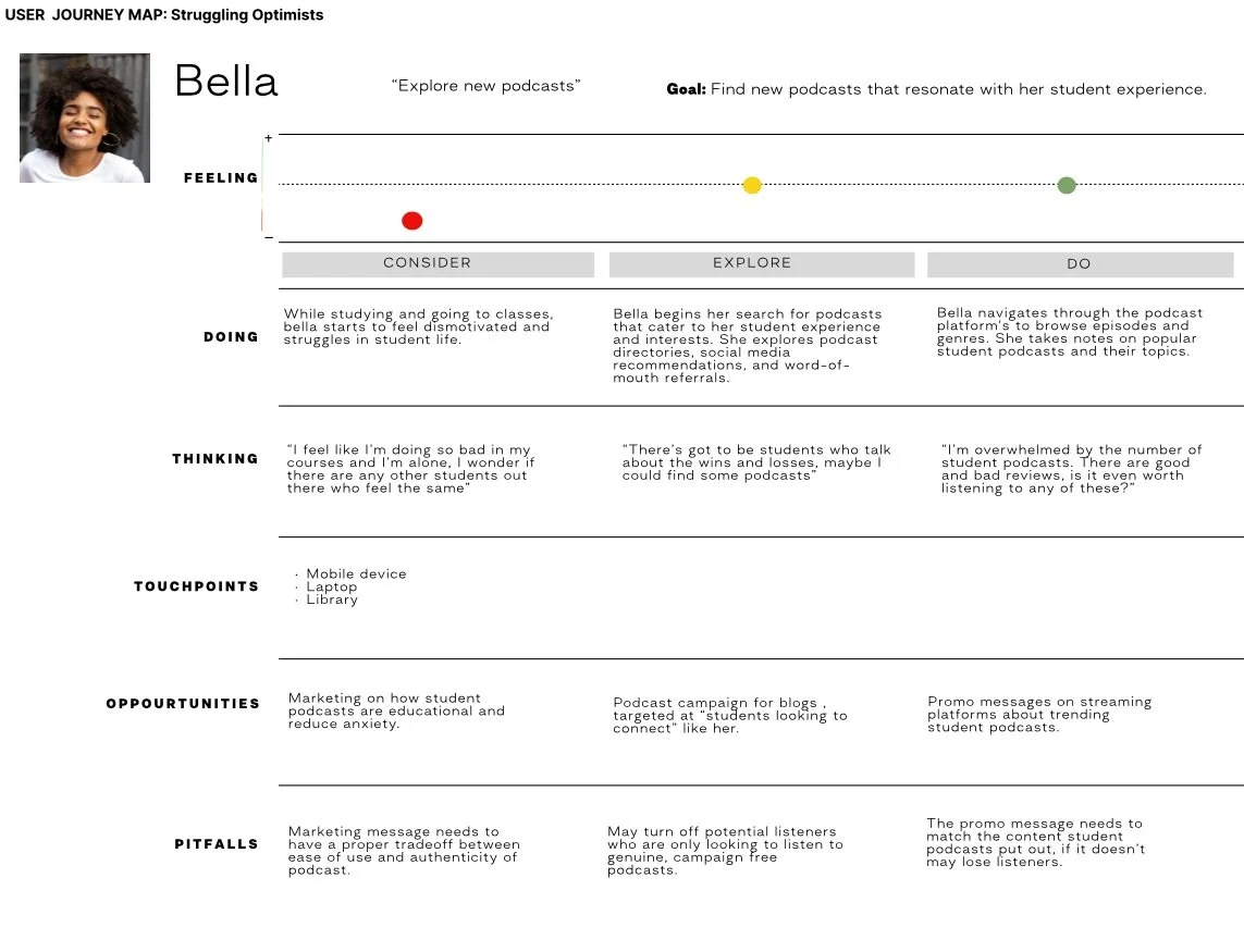
Creating a journey map revealed emotional nuances of different points of interaction that could be addressed in the podcast listening path. How information is presented and how paths are defined could make a difference in whether users abandoned listening to a certain podcast. So, in pushing design forward, it was important to maintain the flat site structure to minimize disruption, and ensure that various points in the task flows for podcaster and listener addressed concerns like this.
2.0 Design
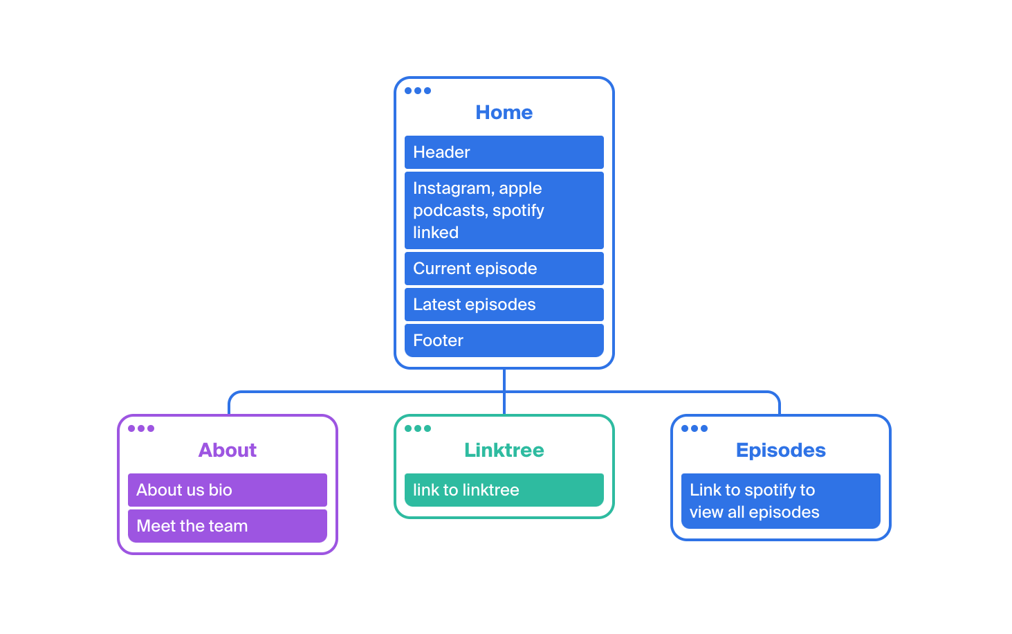
Building a Framework for Design
Visualizing a Seamless Integration
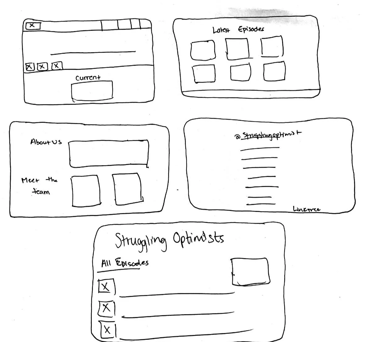
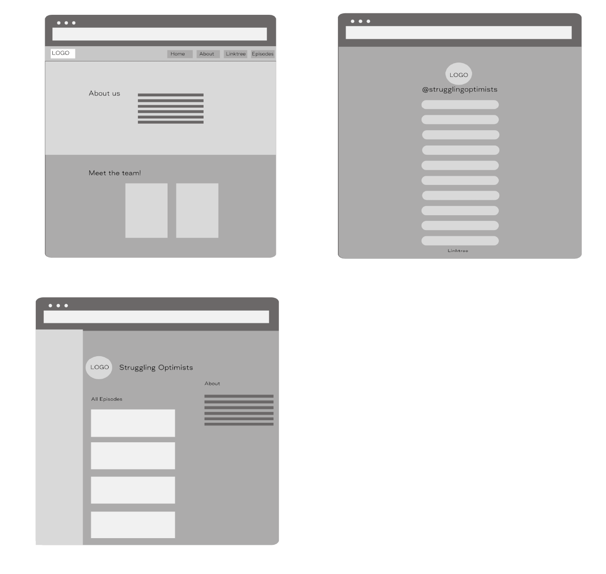
Rapid sketching allowed me to explore design patterns common podcast websites in the competitive landscape, helping me understand which needed to carry over into struggling optimists to ensure familiarity.
Low-fidelity prototype testing allowed me to better understand how users expected to interact with the podcast website. By studying their click gestures — and more importantly, having a dialogue with them about what they expected and when — I knew which adjustments needed to be made to lay the foundation for a more fully realized high fidelity prototype.
Prototyping
Visual Design System
Logo Design
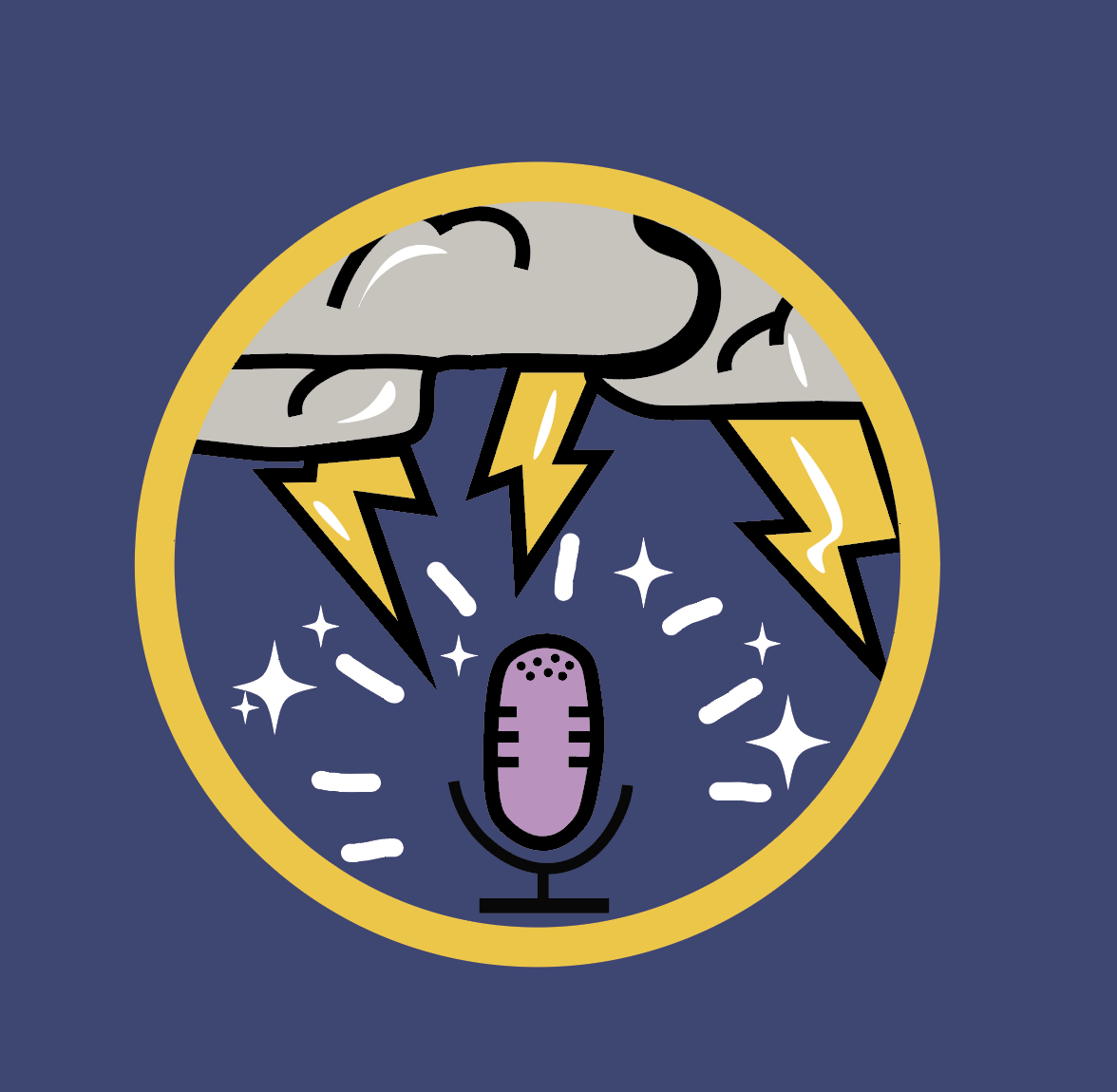
The creation of a logo for struggling optimists was designed to convey several key themes. The logo features a microphone, symbolizing the podcast itself and its focus on student-related topics. The addition of lightning and clouds in the design represents the challenges and difficulties that students face, which are openly discussed on the podcast. Furthermore, the stars and light elements in the logo symbolize the optimism and hope within the student experience, emphasizing the positive aspects of student life. In essence, the logo captures the podcast's mission to address both the struggles and the aspirations of students.
Type and Color
As mentioned previously, I decided to go with the following color palette as it helped invoke the best feeling of ying and yang energy, a highlight of this podcast.
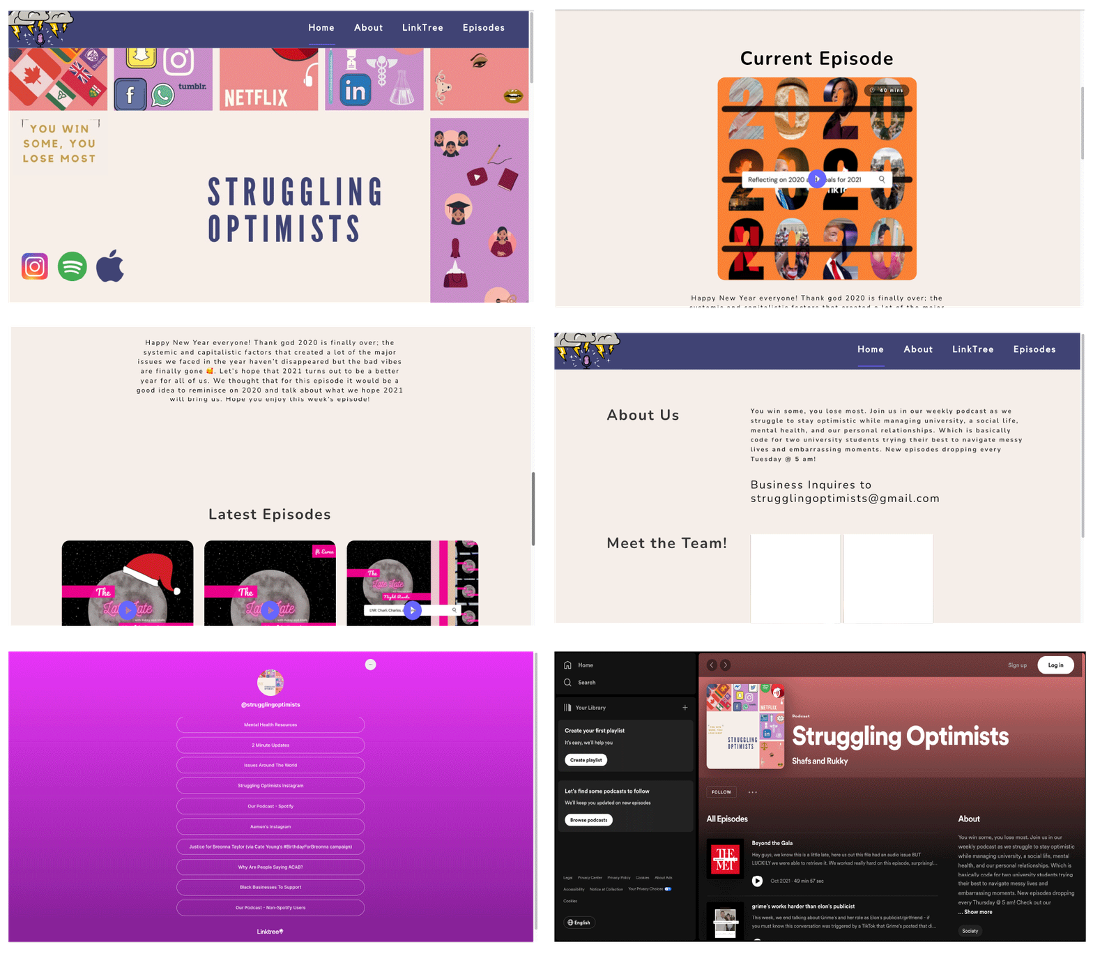
Finalized High Fidelity Prototype

Next Steps
Allow users to leave comments, reviews, and ratings for episodes to foster a sense of community engagement.
Regularly gather user feedback through surveys, polls, and direct communication to understand their needs, preferences, and pain points.
Consider developing a dedicated mobile app for a more personalized and convenient podcast listening experience.
Launch a community section on the website where listeners can connect, share insights, and discuss podcast topics.

