RIDECO
Role - User Experience Designer, UI Designer
Duration - 6 weeks
Tools - Figma, Adobe Create Suite, Whimsical, Sketch, Jira
Project Overview
RideCo offers a globally applicable platform that enhances public transportation systems by utilizing advanced technology and data insights, allowing customization to meet the unique needs of different communities, whether large cities or smaller municipalities, to enhance efficiency and accessibility.
The Challenge
Rideco strives to deliver the best on-demand transit experience to help with efficient day to day transportation use. How might we leverage digital solutions to create a new and engaging transit experience for different clients?
1.0 Research and Discovery
Targeted Solution and Goal
A look at the clients
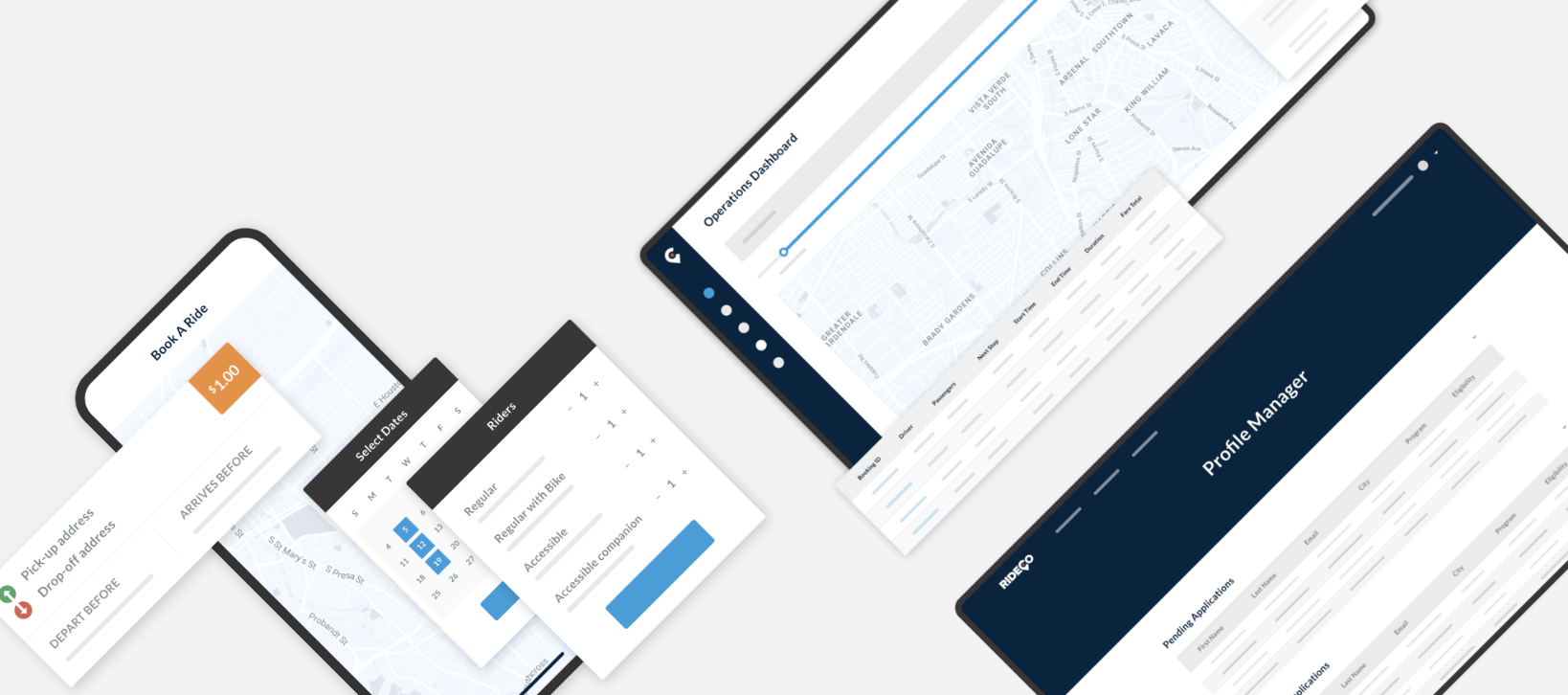
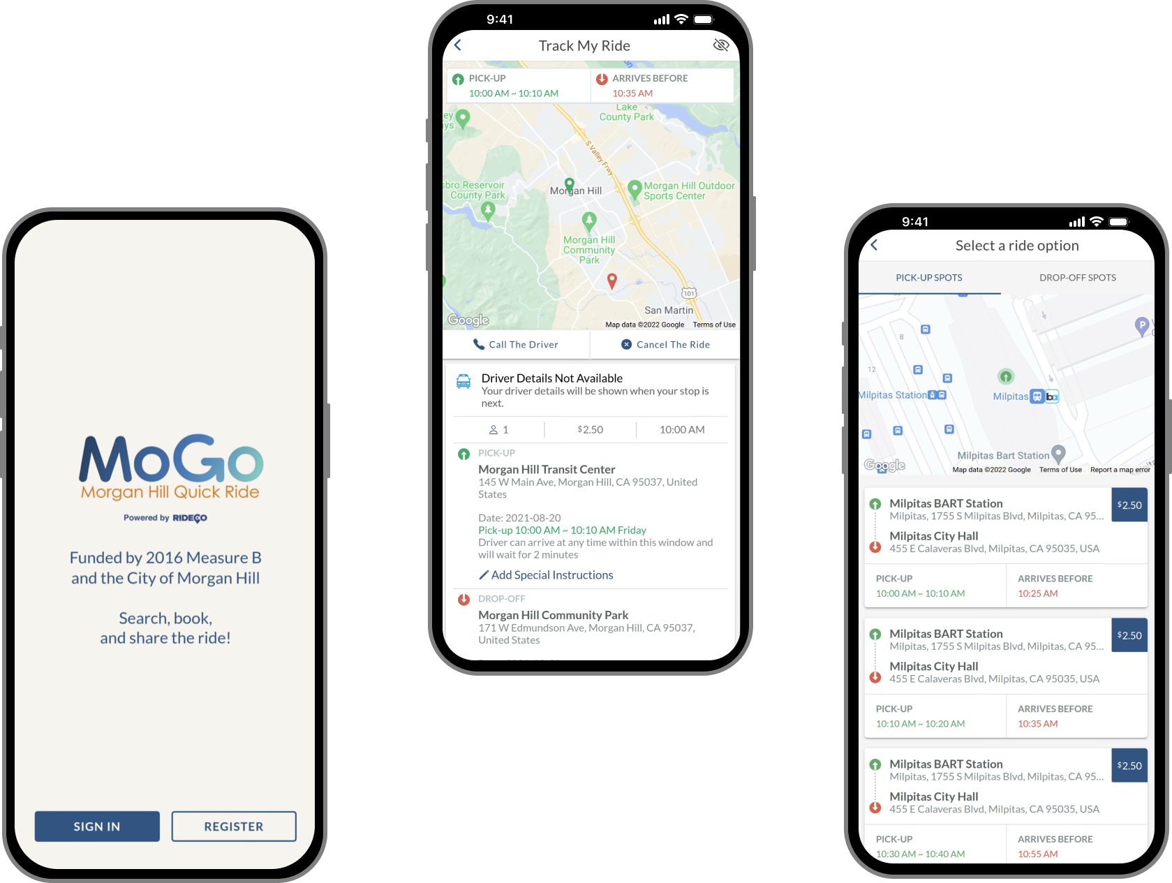
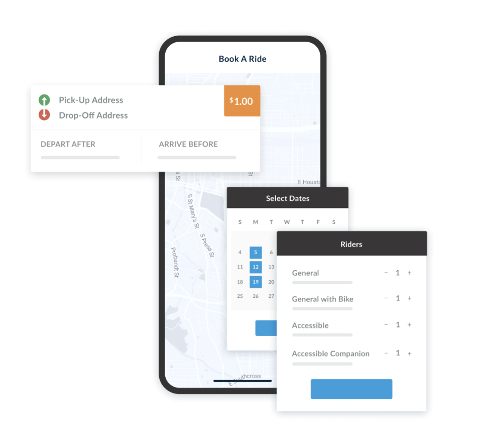
The primary goal of the design for the Passenger App is to provide a seamless and flexible rider experience. The app aims to allow riders to easily request on-demand trips, pre-schedule rides, or book recurring trips, while ensuring on-time performance with guaranteed pick-up and arrive-before times. The design focuses on adaptability by making the app accessible across various platforms and devices, including iOS, Android, and web browsers, to cater to a wide range of users.
Gomicro RTA is an on-demand transit service for the hemet-san Jacinto zone. Gomicro is an easy way to schedule and track trips in real-time. Gomicro uses minibuses to help consumers travel through shared rides in the hemet-san zone. Trips are booked in real time so you can get to your destination quicker.
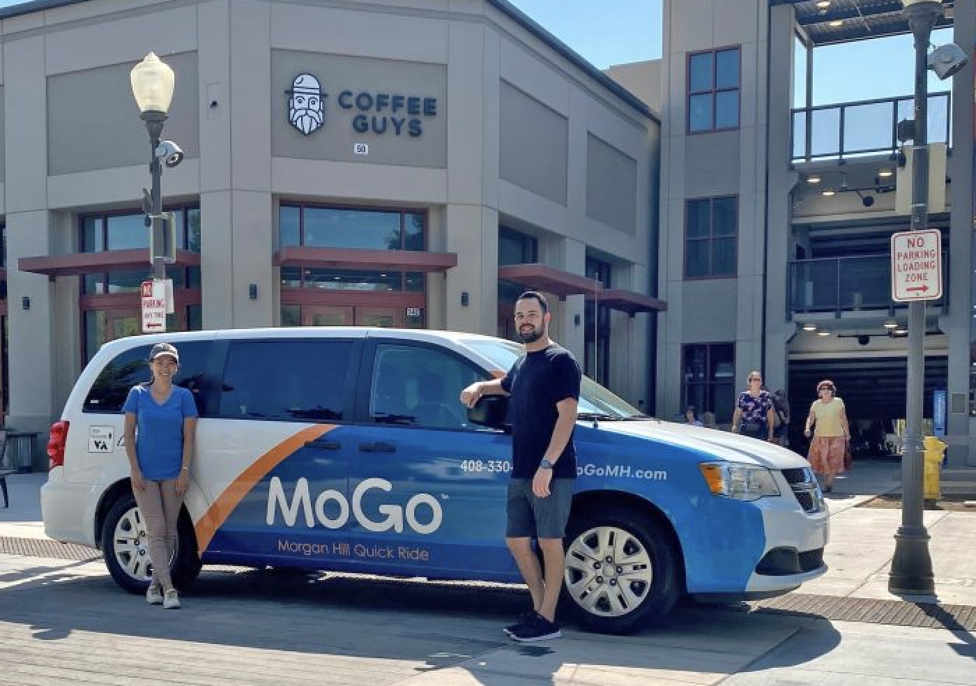
MoGo is Morgan hills on demand ride share service. Mogo offers trips to and from fixed points citywide, within a 10 minute walk to all neighbourhoods and stops at downtown, shopping centres, recreation facilities, businesses, and community spaces! The new service is for short trips and uses small vehicles (seeing up to 5 customers). The service is meant to be fast, safe, and convenient option for quick trips.
Competitive Analysis
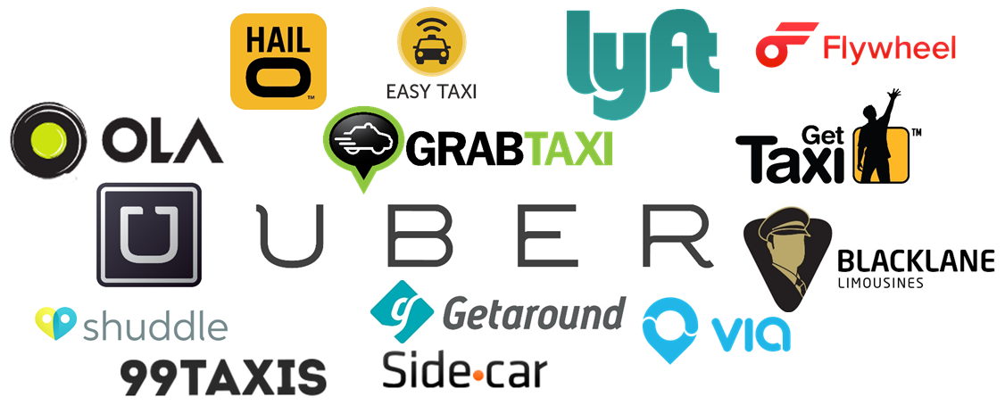
There are no apps involving on demand transit trips within existing public transportation systems. However I analyzed the basic user functions, ride experiences, and user flows of ride sharing apps within the field.
I found the most successful apps all had similar qualities:
They had some kind of tracking for rides with drivers
Features allowed passengers to chose which kind of ride they want
Accessibility and security features
User Interviews
As part of my competitive analysis, I investigated the needs and requirements of Rideco's existing clients, focusing on their mission and the user interface of their products. More than 100 user survey responses would help quantify what passengers are looking for and hoping to resolve. And lastly, one-on-one interviews would help me understand users’ journeys and specific issues the app would need to address.
What I learned..
1. Accessibility & Inclusivity: A number of passengers had complained about the complexity of the interface, which made it difficult to navigate. Additionally, there was a lack of support for accessibility features, which was a significant barrier for users with disabilities.
2. Slow Response Times: Passengers reported that the app provided basic responses, which resulted in a less user-friendly experience, often leading to repetitive or looped responses.

What did I want to accomplish?
Inclusivity: My goal was to create client apps that are accessible to all users. To achieve this, the app will incorporate industry standards and best practices for accessibility, ensuring that usability is not hindered for any user.
Convenience: As the app is designed to cater to a diverse audience, I want to ensure that users can access it on multiple devices, anytime and anywhere. This will require a user-friendly and responsive design that is compatible with various platforms and devices.
2.0 Design
Building a Framework for Design
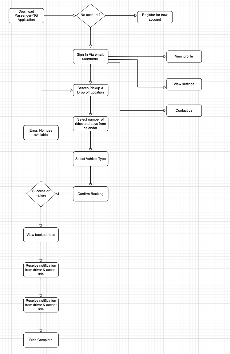
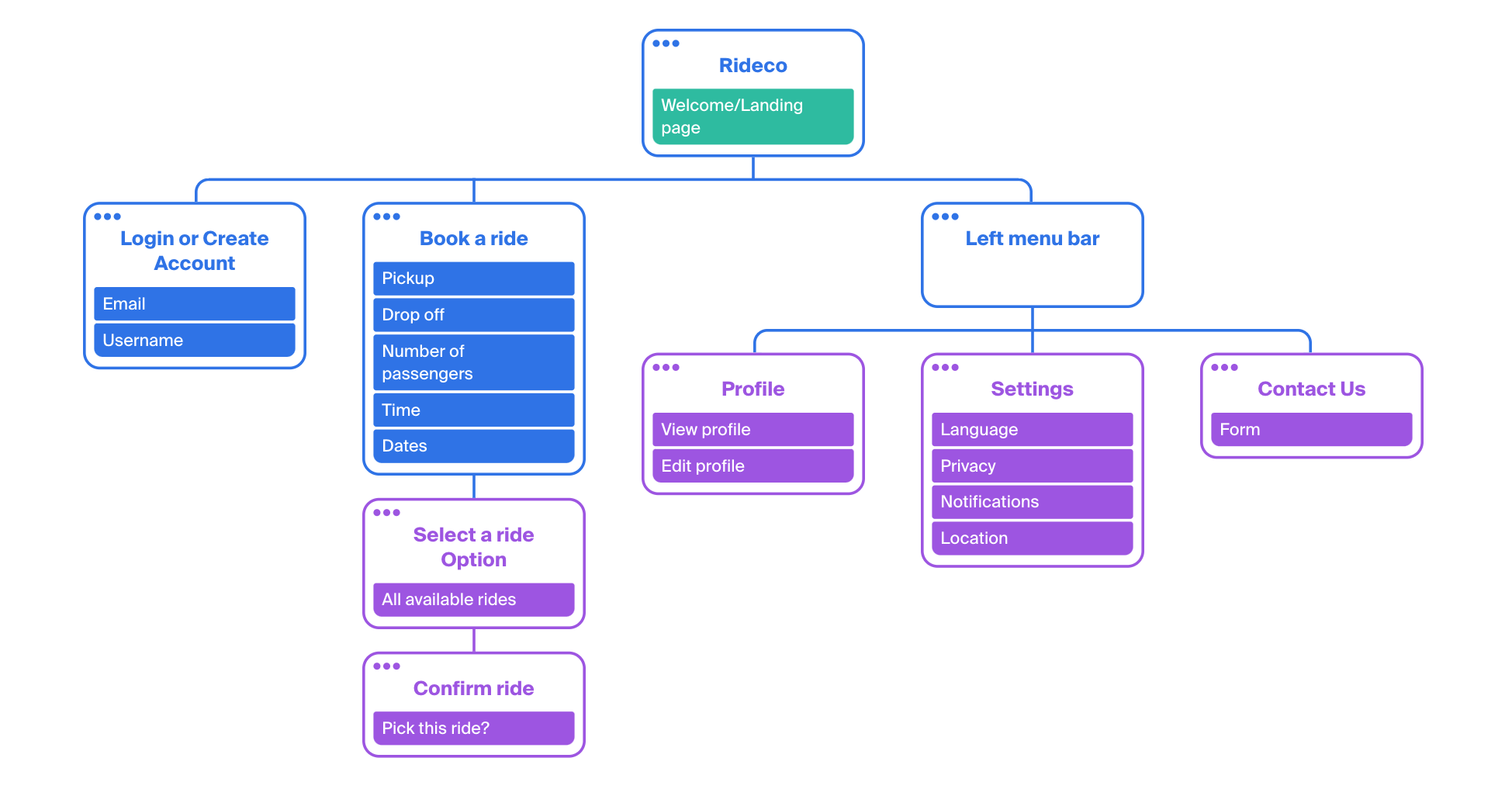
Based on the research and user interviews, I created the user flow to build a representation of the product.
User Flow: Rideco for GoMicro & Mogo Clients
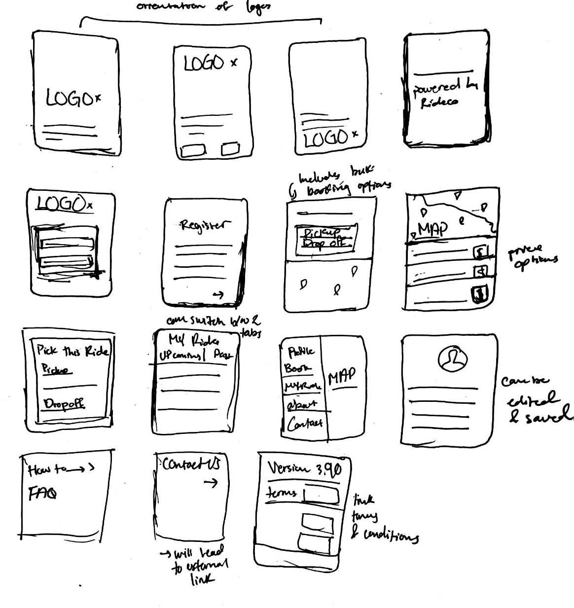
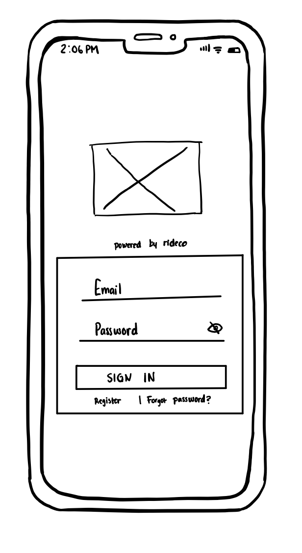
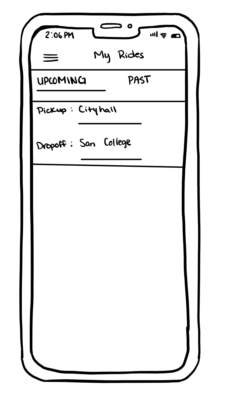
Identifying Design Patterns Through Rapid Sketching
This site map, informed by surveys and interviews, organizationally depicts the three key tasks that the high fidelity prototype would focus on:
1. Onboarding and registration
2. Booking a ride (selecting different variables)
3. Passenger account and setting-related functions.
The framework the site map provides, along with the user insight collected thus far, would guide design decisions moving forward.
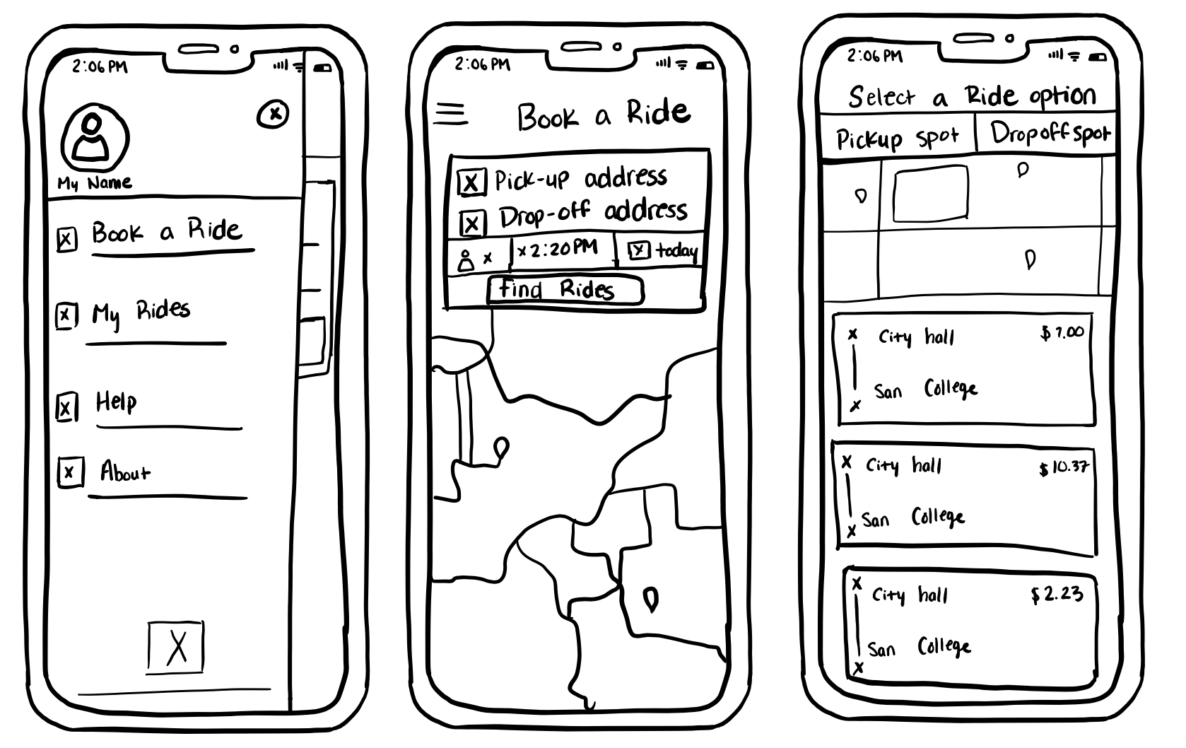
Rapid sketching allowed me to explore design patterns common among apps in the competitive landscape, helping me understand which needed to carry over into Rideco clients to ensure familiarity. This also helped identify screen types that could serve multiple functions, as well as swiping/touch gestures that would likely be the most intuitive.
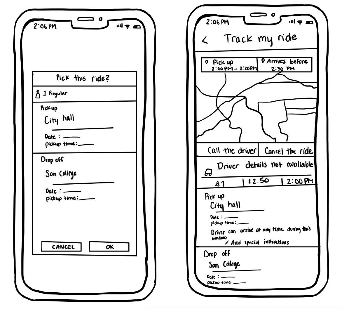
Low-fidelity prototype testing allowed me to better understand how users expected to complete the tasks I was focusing on. By studying their touch and swipe gestures — and more importantly, having a dialogue with them about what they expected and when — I knew which adjustments needed to be made to lay the foundation for a more fully realized high fidelity prototype.
Prototyping
High Fidelity Prototype
The high-fidelity prototype brought test users closest to the real experience.
Design Strategy
Elements
I chose colors, fonts, and patterns that reflected the clients missions and goals. This included custom logos that created a business professional yet user friendly for the user.
White Space
The design needed to align with the website, so I increased the amount of space between elements. This allowed for a cohesive and more quality look, making the elements stand out more for the user to digest.
3.0 Validation
User Testing
The design needed to align with the website, so I increased the amount of space between elements. This allowed for a cohesive and more quality look, making the elements stand out more for the user to digest.
I was able to conduct user testing with the clients and their teams. During this time, they showed significant interest in the user flow for rides, and the accessibility and ease of the app. Several people returned to engage with the app outside and inside work. I was also interested to see what they enjoyed about the app and what they would change.

How Usability Might Be Improved
Lessons Learned
1. Minimize the number of steps required to request a ride. Streamline the booking process to make it as straightforward as possible.
2. Display available ride options clearly, including vehicle types, prices, and estimated arrival times.
3. Provide notifications when the driver is approaching, has arrived, or if there are any delays.
4. Use past ride data to suggest favourite ride locations, such as home and work addresses, to make booking faster for repeat users.
5. Offer in-app customer support that xis easily accessible, including chat or messaging options.
I went into this project assuming the app would only provide a single function: to offer rides to passengers. I learned very quickly, however, that users needed information they didn’t have access to, in order to book the best ride.
1. Implement robust security features to protect user data and payment information.
2. People search for things to watch in many different ways, and if those variables are available for filtering purposes, they would rather have more, not less options.
