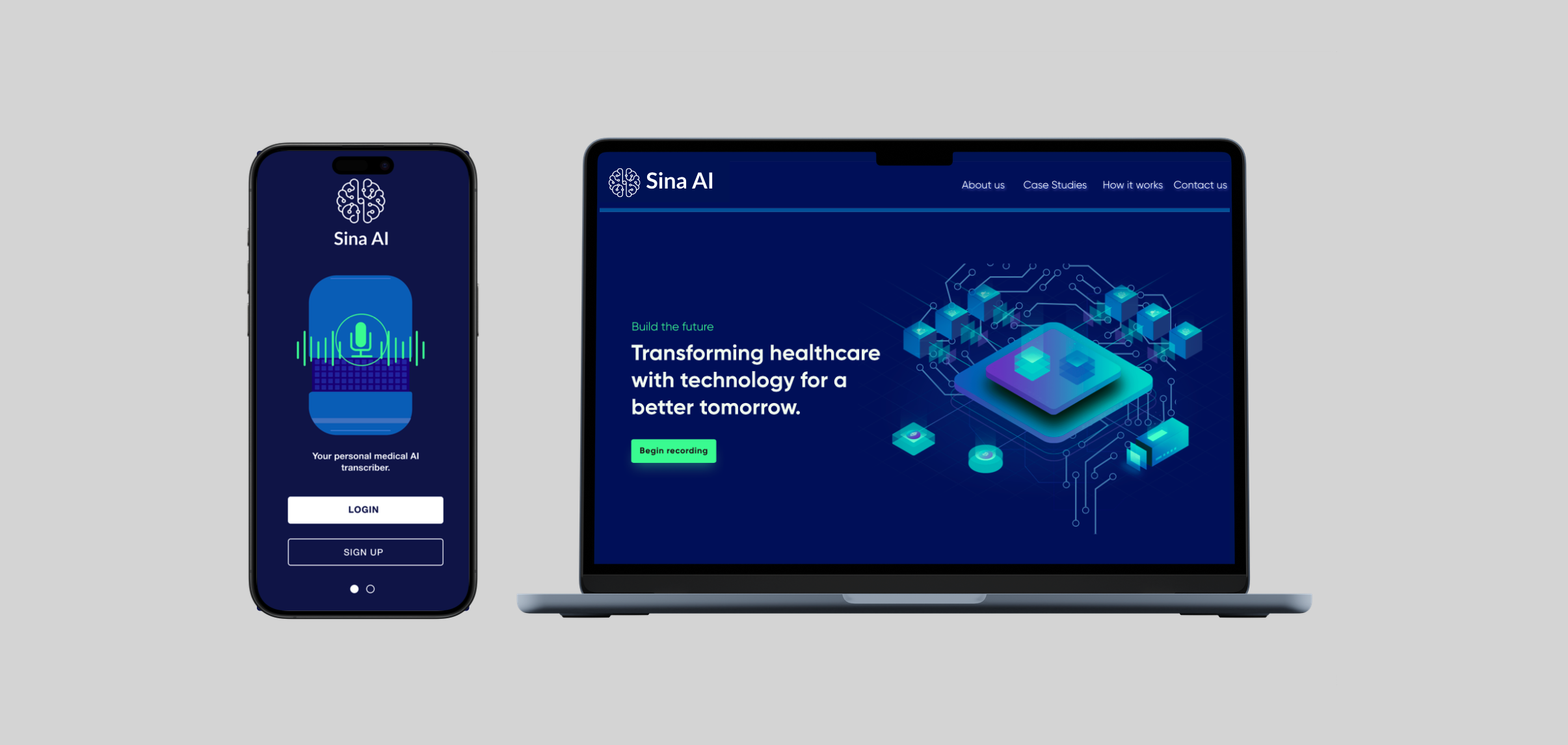
Sina AI
Role - User Experience Designer, UI Designer
Duration - 10 weeks
Tools - Figma, Adobe Create Suite, Whimsical, Sketch, Jira, Confluence, Octopus
https://sinaai.ca/
Project Overview
Doctors have long brought up the issue of delayed periods for medical note transcriptions for patient appointments. 47% of clinicians are burned out with 60% citing administrative tasks as the primary contributor. 89% of those considering leaving medicine cite burnout as the main cause. This accounts for a series of efficiency issues including lost patient data, and wasted healthcare resources.
How can we deliver a digital solution to reduce wasted resources and time?
The Challenge
Medical transcription services, conducted by trained individuals, often lead to delays of days to weeks, impacting patient care and third-party communication. Errors in transcriptions pose risks, and both outsourcing and in-house options are costly, with security concerns for patient data.
A single provider turnover can cost healthcare systems $1,000,000. Meanwhile, 30% of medical notes are under-coded, leading to $9,000 in missed reimbursement per month.
The Process
1.0 Research and Discovery
Targeted Solution and Goal
The primary goal of this project was to design a cross platform application which uses speech recognition and recording with patient visits to extract and transcribe medical notes for medical professionals. My goals focused on the following three:
1.Design with a user centred approach in mind
2.Address accessibility for those with limited digital experience
3.Use a fine-tuned large language model to process the content of a doctor-patient conversation and create a SOAP note containing all the key information.
Competitive Analysis
Strengths:
Speech to text
Summarizes audio
Translation
Chat bot
Calendar
Weaknesses:
Too many features, overwhelming
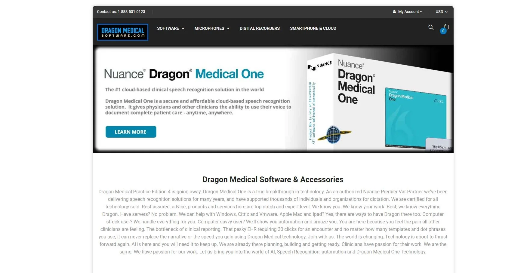
Summary is not detailed, as it is a general transcription service
Strengths:
high accuracy and recognition of medical terminology
Integrates with EHR systems
Weaknesses:
Extremely simple UI
Confusing, not intuitive to navigate
Strengths:
Integrates well with most clinical systems
Works across several platforms bc of cloud based system
Weaknesses:
Ivery old UI, with lack of iconography
Confuses user (90s style theme)
Glitches and bugs
In order to determine how to best address the deficiencies of medical transcription, I began my research with a competitive analysis. I wanted to understand the approaches of competing healthcare transcription services.
I also wanted to identify functions and usability gaps by looking at alternative solutions.
User Interviews
Qualitative user surveys would help me understand what patient related information and platform functionalities are most important to medical professionals, so I could prioritize them.
Finally one-on-one interviews could help me uncover user’s journey in recording and uploading appointments, as well as identifying their pain points.
What I learned..
1.Users wanted a single user flow system that would take them from start (recording and uploading) to finish (having notes extracted from recording).
2. There was an emphasis for patient privacy and security, in order to protect patient data.
3. The time consuming process for transcription and medical documentation leads to a significant usability gap. Streamlining the workflow is crucial for improved efficiency.
4. Many medical professionals that have not dealt with transcription, emphasized a need for accessibility for those who weren’t “tech-savvy”.
2.0 Developing User Empathy
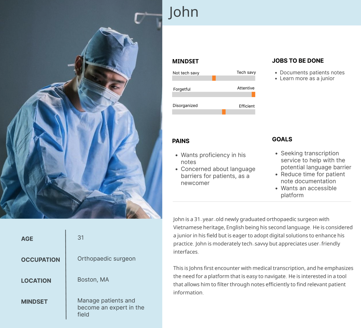
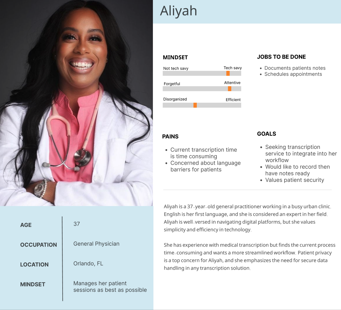
Although the target user base is medical professionals, there is still a wide variety within. I felt it was important to represent as many professionals through two personas. These were designed by cross referencing quantitative and qualitative data from user interviews. These personas would serve as important reference points for design decisions moving forward. For both “Aliyah” and “John”.
User group could have the following traits:
The ability to navigate digital platforms
English may or may not be their first language
May be junior or expert within their respective fields
Median age is early to mid 30’s, but can skew older
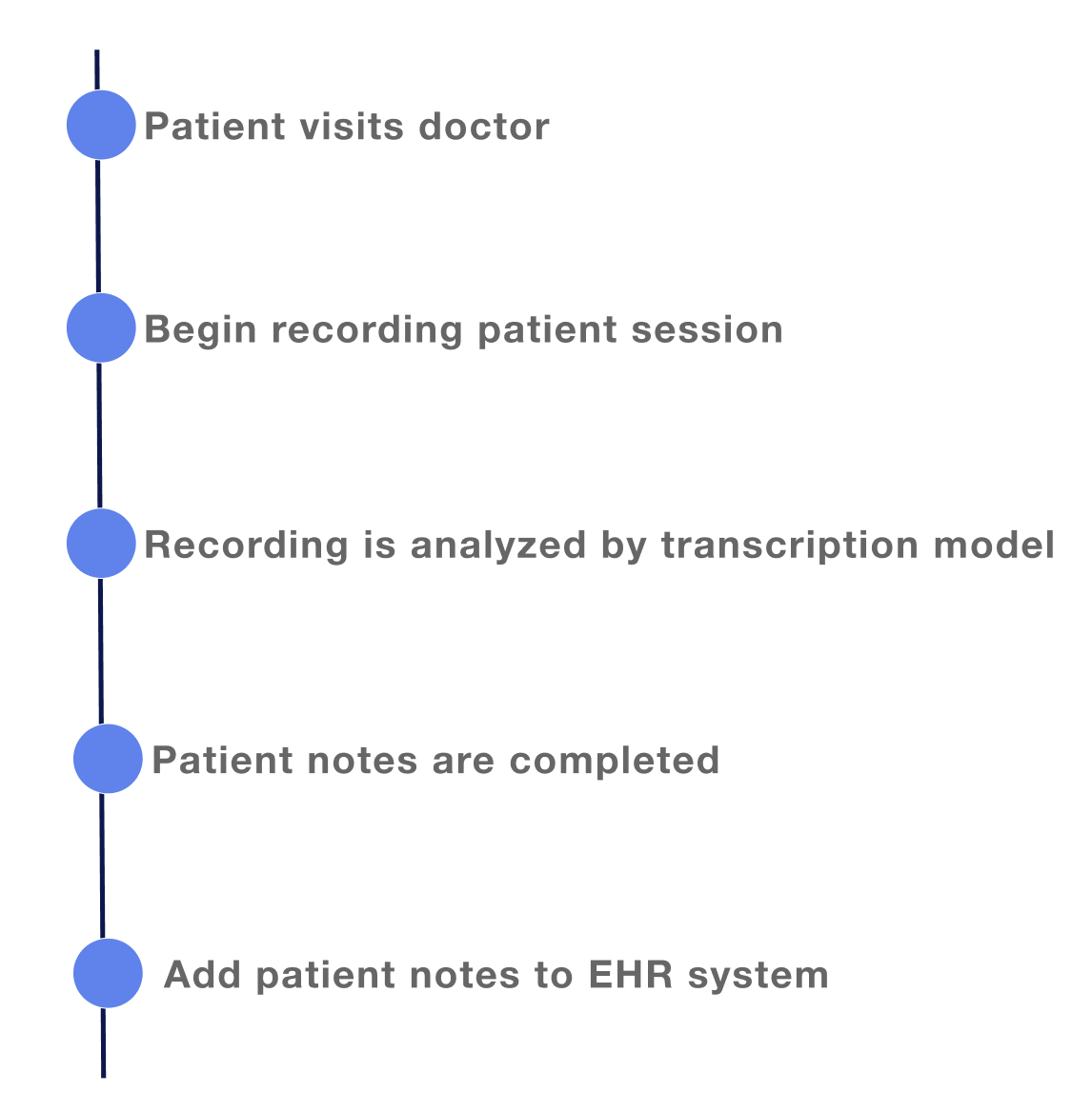
I created a journey map to show the current medical professionals experience with transcription for their patient appointments.
3.0 Design
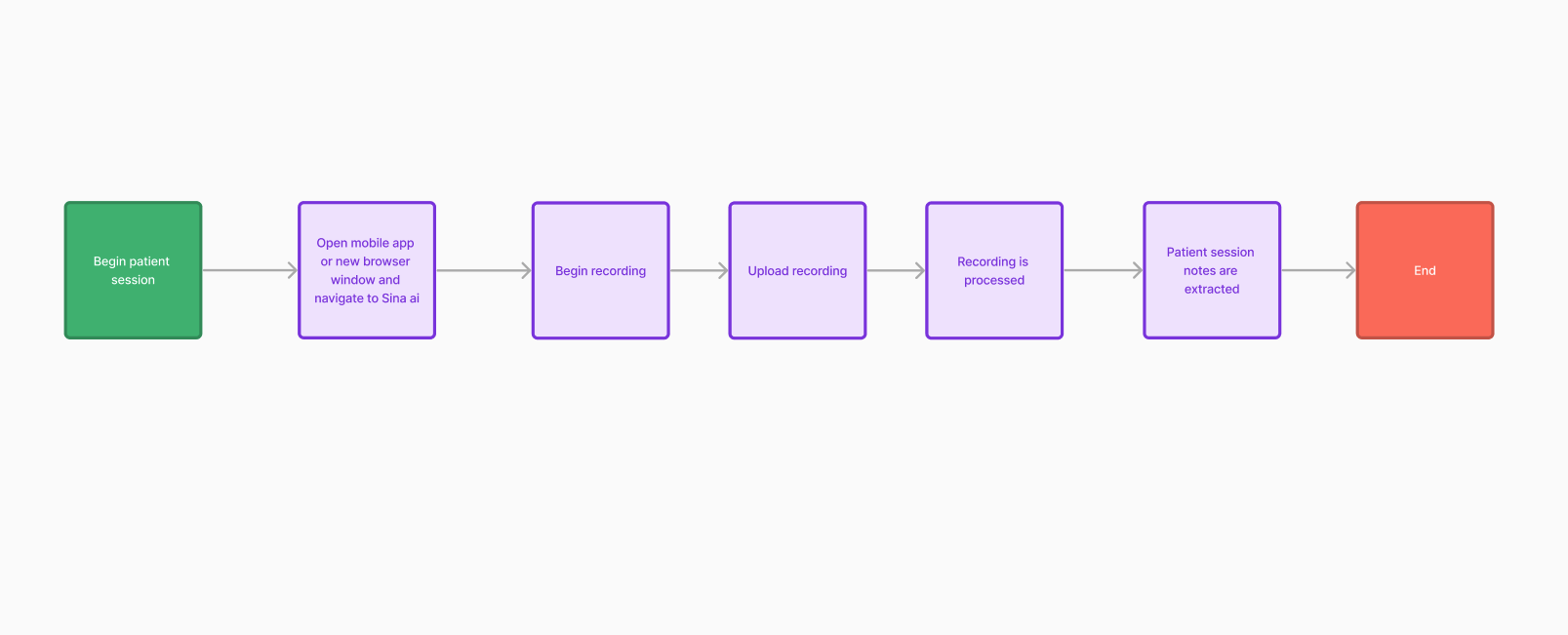
Users said once an appointment began, they wanted to immediately begin recording either through a platform where they would later upload it. Additionally, they wanted the upload and processing of recordings to happen within a few clicks from the landing/home page. This task flow deceits that optimized and linear journey.
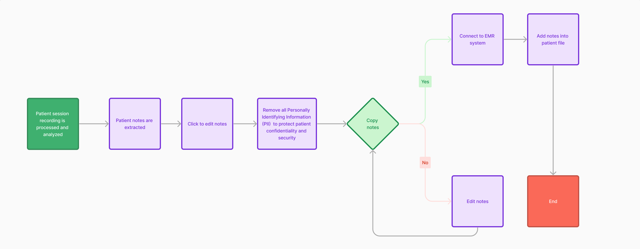
A second task flow for the produced notes simplifies those with limited digital experience while also maintaining patient privacy. After recordings are analyzed and notes are extracted, all personally identifying information (PII) is removed by HIIPA standards, allowing medical professionals to copy the notes directly into their medical database and add patient information themselves.
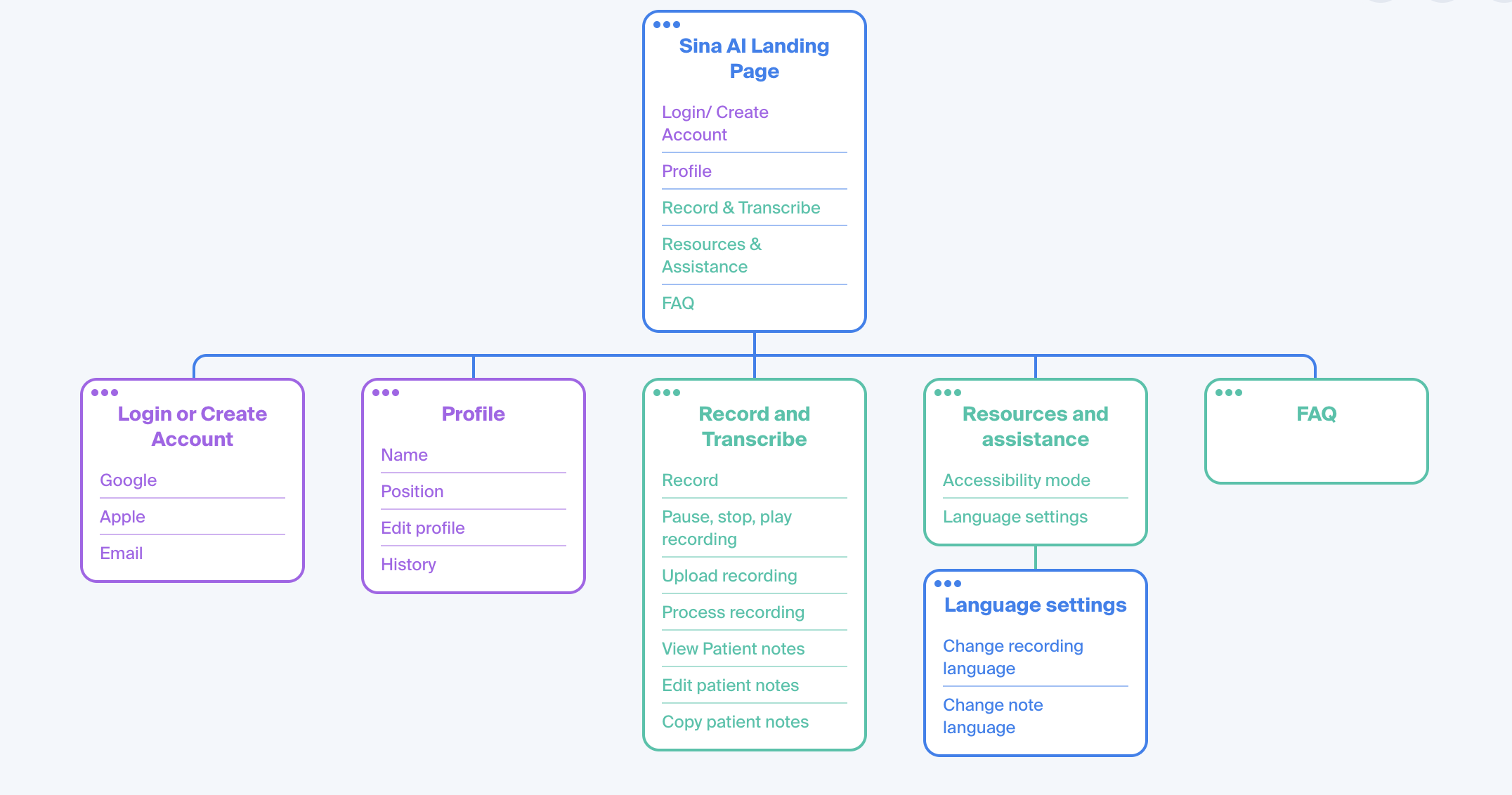
This site map, a result of the surveys, interviews, and competitive analysis conducted, revealed the following:
Users wanted to upload recordings with ease
They wanted a single recording process that was easy to understand
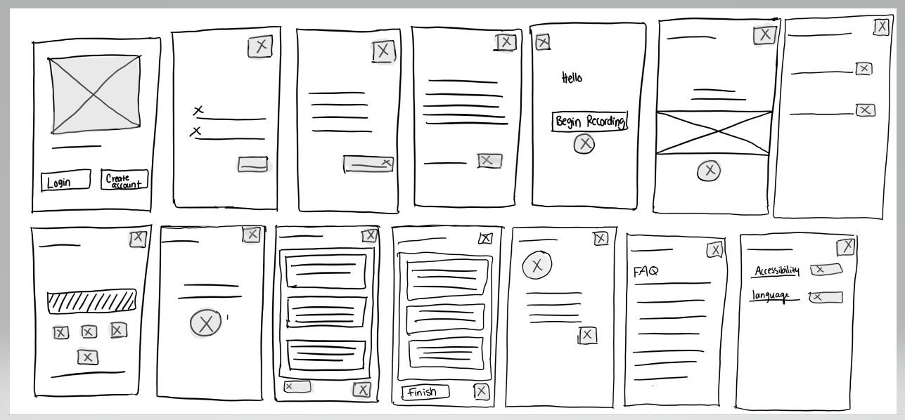
Identifying Design Patterns Through Rapid Sketching
By exploring page organization through sketching, I learned that the best way forward was through very clean organized pages that allowed for the most intuitive swiping/touch gestures.
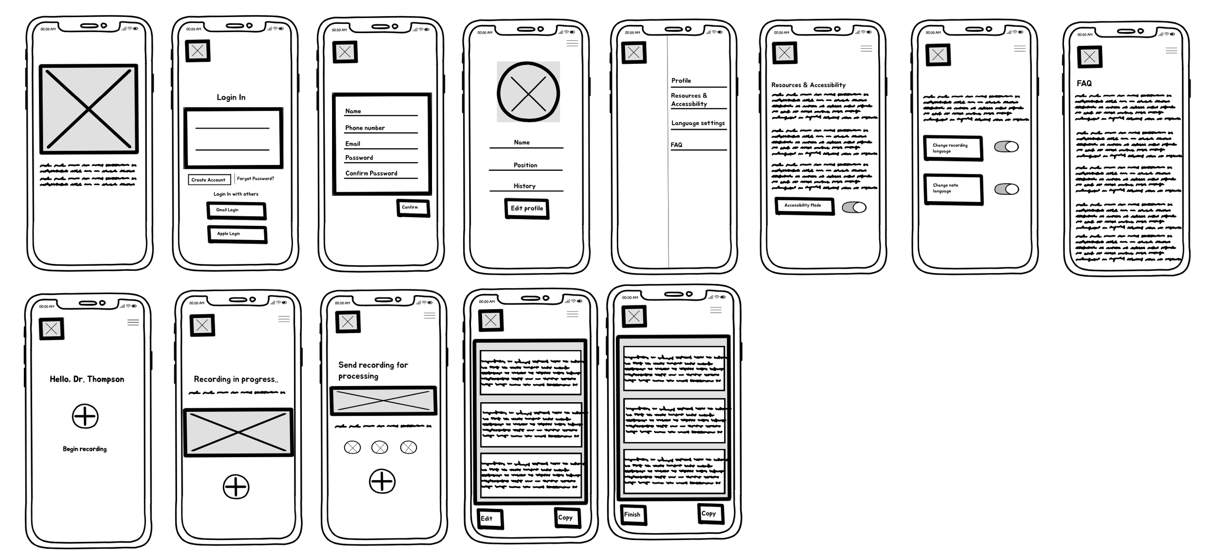
Prototyping
Low-fidelity prototype testing allowed me to better understand how users expected to complete the tasks I was focusing on. By studying their touch and swipe gestures — and more importantly, having a dialogue with them about what they expected and when — I knew which adjustments needed to be made to lay the foundation for a more fully realized high fidelity prototype.
High Fidelity Prototype
The high-fidelity prototype brought test users closest to the real experience.
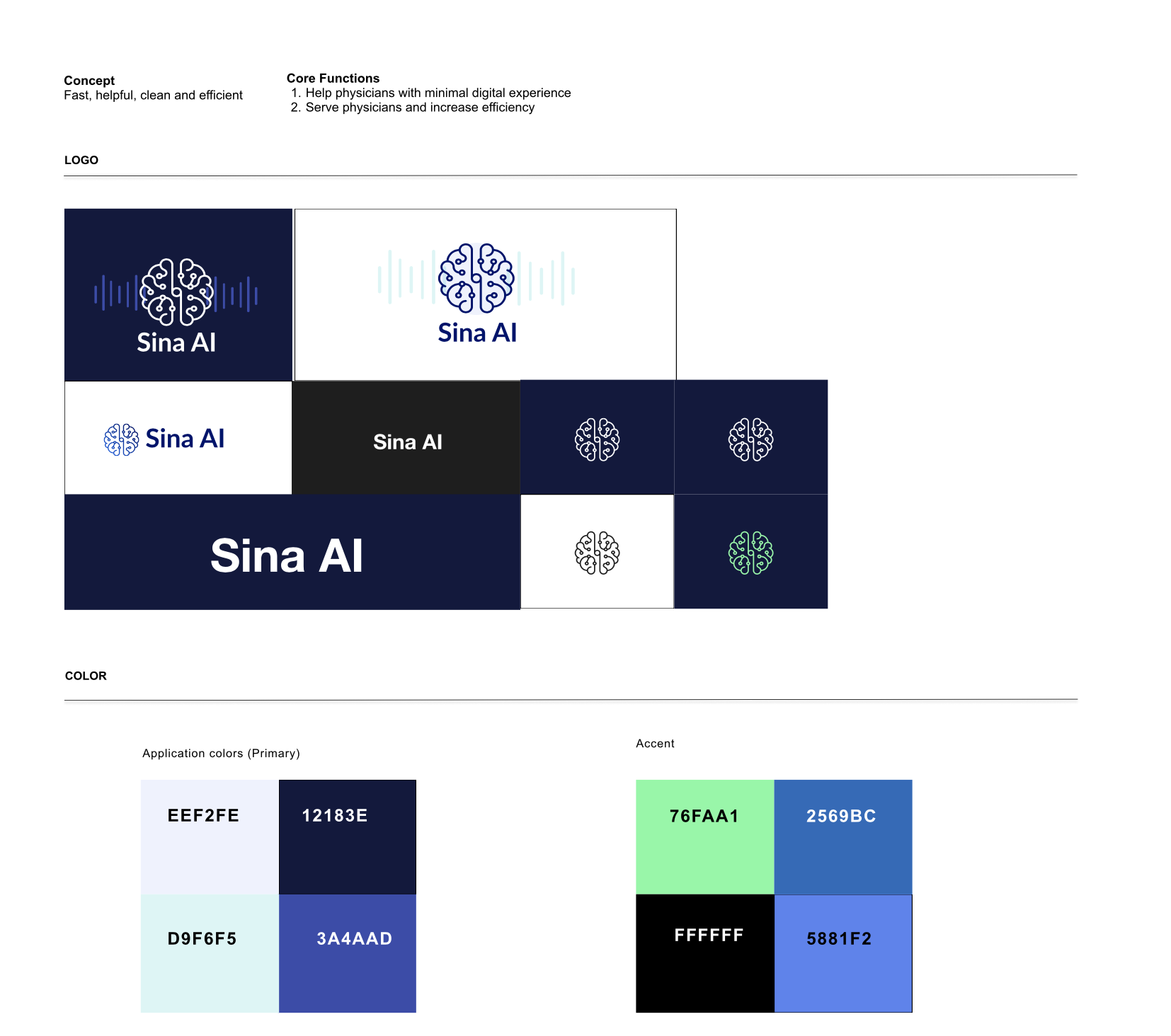
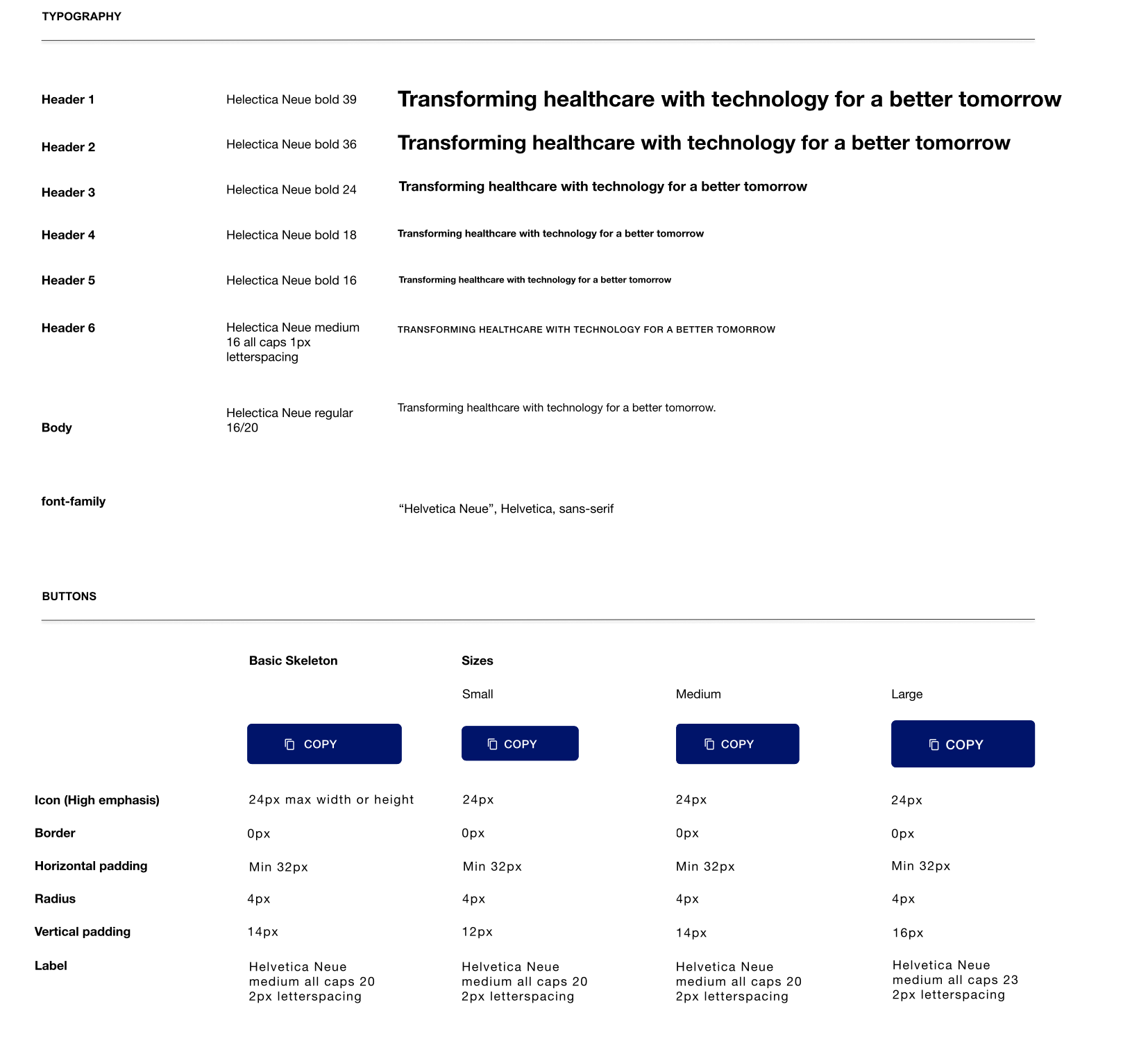
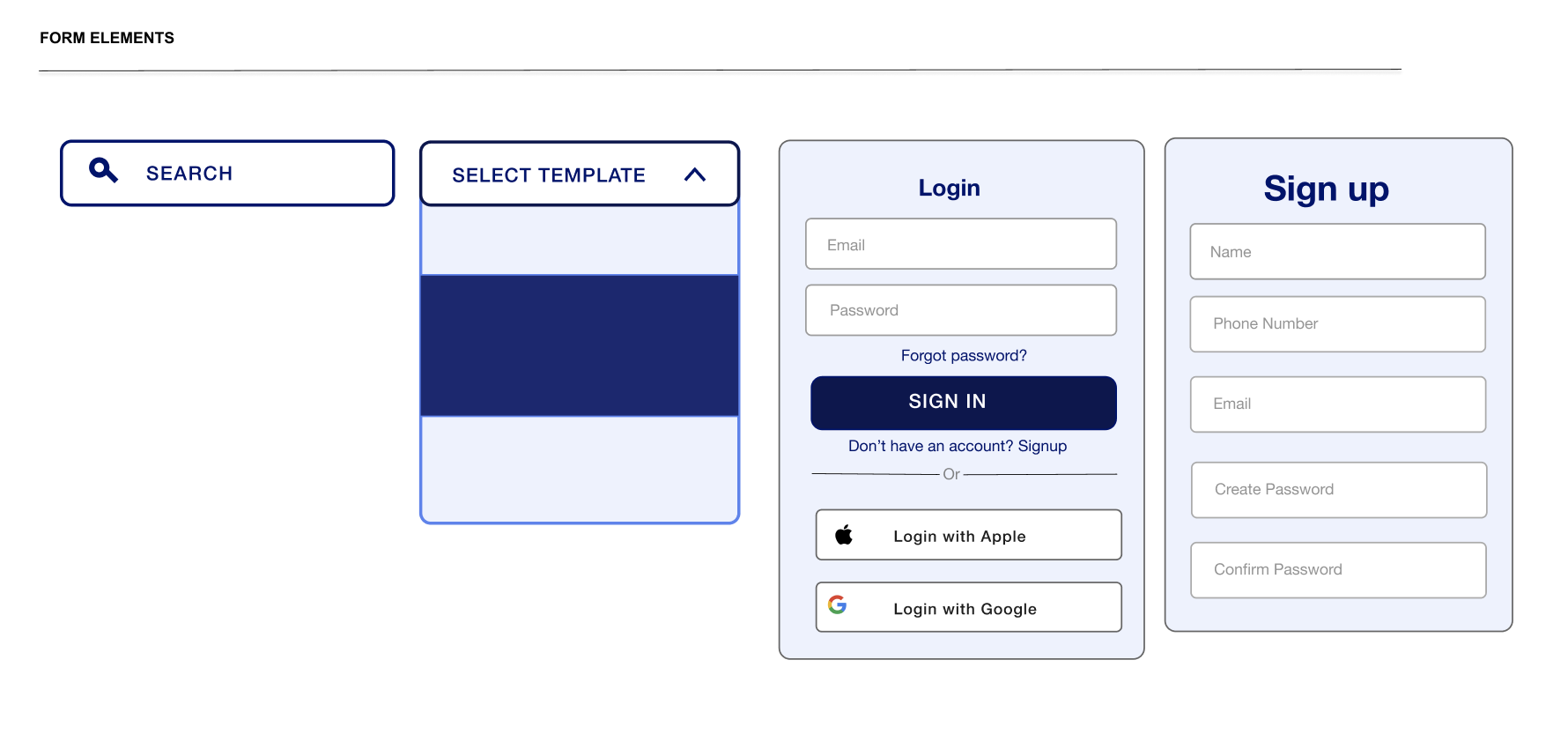
Since this was the creation of an ai based medical transcription service, this provided me with the creativity to cover topics such as color, typography, grids, and photography, from a high level perspective. I was provided some base brand guidelines, with an emphasis on ensuring the design kit was accessible and welcoming.
I developed a UI kit because the recording and uploading process as well as secure patient Dara were critical to the success of this platform. This new UI kit designed was on brand and aligned with Sina ai’s mission.
Design Strategy
3.0 Validation
User Testing
I was able to conduct user testing with the clients at varying clinics. During this time I was able to receive reporting on accessibility, user flow and ease, as well as the ease of recording and processing patient notes.
Several clients found the application very intuitive and easy to use, and reported they would return to use it. I was also interested to see what they enjoyed about the app and what they would change.

How Usability Might Be Improved
1. Simplify the workflow of initiating, pausing, and processing recordings to increase efficiency and accuracy.
2. Include a chat assistant to help with any additional information or guidance.
3. Allowing users to personalize settings including transcription language, and terminology preferences.
4. Include additional accessibility features including screen reader compatibility and keyboard navigation.
